In the fast-moving digital age, users demand that websites load fast, appear wonderful, and work perfectly—particularly on smartphones. With over 60% of web traffic” originating from tablets and smartphones, “mobile responsiveness “is not a choice anymore—it’s a must. Regardless of whether you’re a startup, a small business, or an enterprise, possessing a mobile-responsive website is imperative to remain competitive in the virtual marketplace.

1.The Shift Towards Mobile Usage
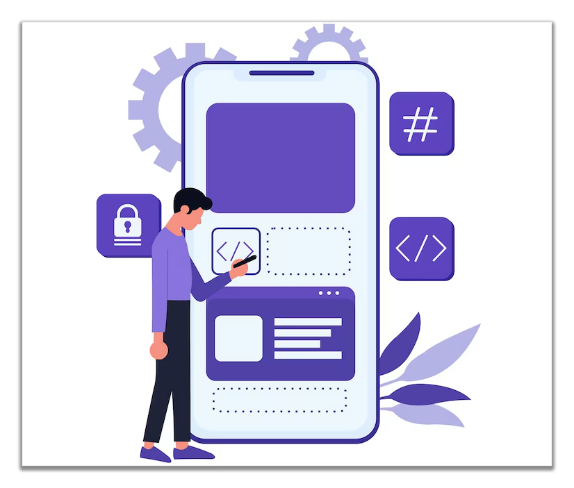
Those were the days when internet browsing was done only on computers. Now, users surf websites while traveling, shopping, or sitting on the couch—all using their phones. If your site is not mobile-friendly, you stand to lose a significant number of potential customers. Responsive website development makes sure that your site is displayed and functions well on every screen size.
A “mobile responsive website” will naturally change its layout, font size, images, and interactive components automatically to deliver a smooth experience no matter what device is being used. It’s not simply a matter of fitting the screen—it’s about staying fast and functional.
2.Improves SEO Performance
Google employs mobile-first indexing, so it mainly focuses on your site’s mobile version when ranking and indexing. If your site isn’t mobile responsive, your SEO ranking will be negatively affected. That means lower organic traffic and fewer leads.
A well-organized web application development strategy with mobile responsiveness keeps you in the limelight on search engines. Load times are quicker, navigation is better, and content is optimized, resulting in higher rankings.
3.Improves User Experience (UX)
User experience matters. Customers expect websites that are intuitive and easy to navigate. When they encounter a non-mobile optimized site—small text, buried images, or non-functional buttons—they’ll bounce in seconds.
A good front end developer is keen on building responsive layouts that improve user engagement. Touch-friendly menus, readable font sizes, and usable forms mean visitors linger longer, enhancing the possibility of conversion.
-
Lowers Bounce Rate and Boosts Conversions
High bounce rate is usually caused by bad mobile experiences. Search engines believe your content is not relevant if users quickly navigate away from your site. A responsive website design** can significantly reduce your bounce rate by making your site user-friendly and interesting on any device.
Additionally, mobile users are more apt to act fast—complete forms, buy, or call you. That’s why an investment in **web design services** that focus on mobile responsiveness can go straight to improved business outcomes.
5.One Website, Many Devices
Previously, firms produced duplicate mobile sites of their websites. That practice no longer applies. With responsive **web development**, you use one codebase that scales across different devices.
This saves money on maintenance and allows for uniform branding and functionality. Regardless of whether users view your site on a smartphone, tablet, or desktop, they’ll have the same seamless experience.
6.Competitive Advantage*
If your competitors’ websites are mobile-friendly and yours aren’t, they’re already ahead. Customers are more likely to trust and interact with companies that provide seamless digital experiences. With professional **website creation services**, you can guarantee your website stands out and performs at its best.
7.Future-Proof Your Website**
As new devices of different screen sizes make their way onto the market, a responsive design keeps your site current and usable. A good **web development** approach that includes responsive design will spare you the constant overhauls and redesigns.

Conclusion
In an era where mobile usage has overtaken desktop browsing, having a mobile responsive website is no longer a luxury—it’s a necessity. Your website acts as the digital storefront of your business, and it must be equipped to handle the needs and behaviors of modern users. From the perspective of web development, website design services, and website creation services, responsiveness is a foundational element that enhances both functionality and aesthetics.
A mobile responsive website ensures that every visitor—whether on a smartphone, tablet, or desktop—receives a seamless and optimized experience. It reduces bounce rates, increases user engagement, and significantly boosts conversion rates. When users can navigate your site effortlessly and access content without frustration, they are far more likely to trust your brand and take meaningful actions like subscribing, purchasing, or contacting you.
Moreover, Google’s mobile-first indexing has made responsiveness a crucial part of SEO strategy. Even the most well-written content and attractive offers can go unnoticed if your site doesn’t rank well in search results. Responsive website development not only caters to users but also aligns with search engine requirements, giving you a competitive edge in your industry.
Another key advantage lies in the long-term maintainability and scalability of your website. A responsive design approach means you don’t need separate versions of your site for different devices, reducing development time and costs while ensuring consistency across all platforms. Whether you’re offering web application development services or running an e-commerce platform, responsiveness simplifies updates and future enhancements.
Ultimately, investing in a mobile responsive design is an investment in your brand’s reputation, user satisfaction, and future growth. It signals that your business is modern, trustworthy, and user-centric—qualities that are essential in today’s digital economy. Whether you’re a startup building from scratch or an established company redesigning your online presence, partnering with skilled front end developers or experienced agencies offering website design services will ensure that your website meets today’s standards and tomorrow’s expectations.